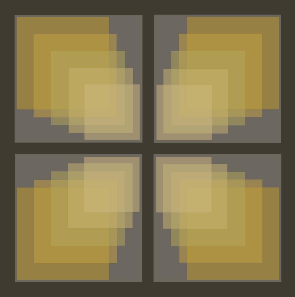
Sunday, September 18, 2005


My Solution -

I took a square of the Klimty Fabric and ghosted a few rectangles over it to come up with a simplified version. I can manage the color cataloguing of that form. I already got the turquoises lined up. So I will post the limited form, the color catalogue and then the final form as a sort of coup de grace. Only thing is the component form is not that strong a design since it is only a component. The way it was designed . . . and it does work is to make it look like light is coming out of it. I wanted it to shimmer just a bit. If you step back from the large design you will see the lights coming out of it. It is an impressionistic trick, and quite cool really. I probably just need a better form . . . like Van Gogh's Starry night. I guess I could work on something like that too. Anyway, this is the limited Klimty fabric form

Final Project - I worked all day - I love it - AND
of course it will not work. The trouble is that we are supposed to use at least 25 colors and then save and catalogue those colors in an organized way. So I made this lovely creation, call it Klimty Waves if you must, but how many colors? I can't possibly get them all. Possibly 1000. Yikes, what a job. Should I do it? Could I do it? Well take a look. I don't know how it is going to post by the time the blogspot tames it down. Maybe I could handle it after that.

Thursday, September 15, 2005


This next week our assingment is on color harmony. I have been excited about the assignment for this week for several weeks and have posted one or two of my early attempts. To tell the truth I have been totally frustrated by this assignment. Oh sure, I could come up with a simple design, but since I am still working with the Photoshop Elements program, I am hampered because there is no vector drawing to speak of. So I couldn't seem to get anything very organic. I tried all kinds of things. I have done the prototype so many times in so many different ways that I just about lost my mind . . . I didn't sleep one whole night because I was so into this, and then I did not even like my attempts. I came up with this plan this morning. It is based on the Art Nouveau style and I used a photo from B&W to get a sense of the lotus flowers. I drew it on paper and then I copied it onto color paper, then I cut out each shape and glued it to a separate sheet and scanned it. I scanned the original and then I transferred each shape from the scanned document onto the new picture, stretching etc when needed. So anyway, here it is. The first tile. I am going to make some color variations. Then I will be able to post them.

Instead of discussion questions this week we are going to write a report (shades of junior high) on a painter. We had a list from which to choose. I picked Edvard Munch and I am going to analyze his painting titled "Spring." I must admit I am choosing him because he was so troubled. The painting shows a young woman who is obviously sick sitting a little way from an open window with a blowing curtain and sunlight. The young women has a handkercheif spotted with blood and is looking out the window like "oh sure, I won't ever get out." But there may be more to it. You could read it as "walk towards the light." Or in other words, death would be Spring compared to the winter of tuberculosis. I am looking forward to it. I am somewhat fascinated by the suffering that goes along with illness and what that does to people.

Tuesday, September 13, 2005

WEll, I decided to redo the transparency example after someone wrote an honest critique about my other project. Thanks very much to her. It is so hard to see the truth about your own creations, and it is difficult to accept honest criticism when it means you have to improve. But criticism is a gift and should be thought of as such. I think this design is much stronger than the other one and I am proud of it.
C

Thursday, September 08, 2005


Vibration

A couple more projects to look at. Now I must stop this and take a break and look at the discussion questions for the week.

Wednesday, September 07, 2005


Here is one I made last night, showing the effect of transparency.

I dare you to try to look at this. It is an example of the effect of vibration. It is caused by putting colors together that are different in hue, one warm and one cool, but both are quite saturated and they have similar values. It was fun to make!

Tuesday, September 06, 2005


Alaska Sea and Sky - Wonderful Midtone Grey Values

The clouds had interesting forms this day.

New Curtains for Mom
I just talked to my mom and she knows how to look at my blogspot now! Way to go Mom! She wanted to see a picture of my new curtains. So here they are. I love you Mom and Dad.

Monday, September 05, 2005


Next Assignment - Transparency

This week we worked on making cute little samples of how to make simultaneous contrast work for you. I also learned that what you see on the computer is not what will print. I have to work at the hospital a tremendous amount in the next week . . . Really 2 weeks shoved into one, and I did not get my home health visit done today because when I went to the home they did not answer, not was I able to make telephone contact later. I will try that again tomorrow. Anyway, looking ahead, I realized that I needed to work on the next assignment. We are supposed to make 3 designs. My goodness, I get so entranced with this I can not get anything else done. And it takes me so long. But I think it is worth it. This is the first of 3 designs and I am actually going to post 2 backgrounds. I think it is a very nice example of transparency. The next assignment sample is supposed to show distance . . .but I haven't even started it yet.

My computer skills are improving but a long way from adept.
Still, it is fun. If you are one of my friends or my mom, and if you have time call me and tell me which one you liked the best.

Thursday, September 01, 2005


Sand Dunes - Orange Design
Wow, now I actually get to create art. I looked ahead a couple of weeks in the assignments and we get to make a design and then use different color schemes with it. This one still has the visable dividing lines but I wanted to see what it looked like on my blogger. I am still playing around